
Widths ↔️
Content Width – 816px
Wide Width – 1141px
Full Width – Fullscreen
Typography (Mobile / Desktop) 💬
Heading 1 – 33px / 44px
Heading 2 – 26px / 33px
Heading 3 – 24px
Heading 4 – 19px
Heading 5 – 16px
Heading 6 – 14px
Paragraph – 19px / 16px
This is a link.
- This
- is
- a
- list
- This
- is
- a
- numbered
- list
Buttons 🖲️
Colors 🎨
RVC Black
RVC Dark Gray
RVC Gray
RVC Light Gray
RVC Blue Gray
RVC Blue
RVC Sky Blue
RVC Dark Blue
RVC Pink
RVC Light Pink
RVC Magenta
RVC Dark Magenta
Default Blocks 🏠
Separator
Default (RVC Dark Gray)
Inverted (White)
Quote Block
This is a quote from a person.
Custom Blocks 🏘️
Containers 🫙
Content Container / Background Customizer
Use this block to format content in a single column or to add a background to a section.
Use the fields to change the max-width of the background and it’s inner content as well as the stylized dark gray middle line. You can toggle it on or off and whether the line overlaps with the top of the block or the bottom. If you toggle the middle line on, there will be extra padding added to the block such that the line won’t overlap with it’s inner content. You can also add a top and bottom border around the background.
By default, the background color matches that of the template. Default template is RVC Light Gray and the UFE template is RVC Light Pink. Select the ‘None’ color option to remove the background and the ‘None’ middle line option to remove it.
This Content Container has the RVC Light Pink background, is full width, and has the content set to content width with no middle line. ⤵️
Click here to edit the content.
You can add any kind of block here.

Including images!
Column 1
And other custom blocks!
Column 2
Like this Two Column Content block.
This block has the middle line overlapping the top of this block and the bottom of the previous one! ⤴️
Two Column Content
Displays content into two separate columns. You can place any blocks inside each section and the left column will stack on top on mobile.
The background color will default to the templates color – RVC Light Gray for the default template and RVC Light Pink for the UFE template. Click on the background and use the fields to change the color. To remove the color, choose the ‘None’ color option.
Use the fields to add and remove the top and bottom border as well as the overlapping top and bottom vertical lines.
To add more rows with borders in between, simply drop another Two Column Content block underneath or on top of the current block.
This Two Column Content has the default template color selected for each column. ⤵️
Column 1
Quis sint eiusmod ut non commodo ad anim tempor consequat officia voluptate. Cupidatat anim sint nisi duis est pariatur ea ad est amet Lorem. Officia duis non voluptate consequat nisi quis ut pariatur qui veniam. Ex proident aute labore irure ullamco reprehenderit pariatur eu non nostrud duis dolore amet dolore.
Fugiat deserunt pariatur ullamco aliquip consequat magna in cillum labore.
Column 2
You can add any blocks in these columns; including images!
Irure id qui esse ea sunt sunt eu ad et ad eiusmod dolor eu do.
You can choose a different background color for each column. ⤵️
Column 1
Quis sint eiusmod ut non commodo ad anim tempor consequat officia voluptate. Cupidatat anim sint nisi duis est pariatur ea ad est amet Lorem. Officia duis
Column 2
Quis sint eiusmod ut non commodo ad anim tempor consequat officia voluptate. Cupidatat anim sint nisi duis est pariatur ea ad est amet Lorem. Officia duis non.
Voluptate consequat nisi quis ut pariatur qui veniam. Ex proident aute labore irure ullamco reprehenderit pariatur eu non nostrud duis dolore amet dolore.
Fugiat deserunt pariatur ullamco aliquip consequat magna in cillum labore.
You can also choose if the middle line overlaps into the surrounding blocks. ⤵️
Column 1
Quis sint eiusmod ut non commodo ad anim tetrud duis dolore amet dolore.
Fugiat deserunt pariatur ullamco aliquip consequat magna in cillum labore.
Column 2
Quis sint eiusmod ut non commodo ad anim tempor consequat officia voluptate. Cupidatat anim sint nisi duis est pariatur ea ad est amet Lorem. Oderit pariatur eu non nostrud duis dolore amet dolore.
Fugiat deserunt pariatur ullamco aliquip consequat magna in cillum labore.
For example, the lines go over this Content Container block now. You can turn on the top middle line on this block to add more padding to this content as well.
Image With Half Content
Displays one column on text on an image background.
When selecting the Image With Half Content block in the left side panel, use the fields to change the layout. Choose whether the content column is on the left or right, how wide the background image is, and how wide the content column should be. All of the content column options will be half of the selected width.
If you click on the image background, you can replace the image and use the fields to change the focal point and add or adjust an overlay to make text more readable.
If you click into the content and find that you would like there to be a solid background color behind the content column, select the Group block in the left panel and choose a background color in the styles field tab.
This is the default Image With Half Content. ⤵️

Heading
Tempor aliqua est do labore. In culpa laboris dolor tempor est. Et cillum cillum magna consectetur anim. Sunt cupidatat laboris id id culpa sit. Aliqua ex laborum aliquip mollit consequat amet ea commodo amet ea sunt adipisicing laboris. Consectetur fugiat anim velit do.
Lorem anim Lorem pariatur et proident. Pariatur id non esse anim. Quis est eu anim aute magna magna officia commodo occaecat et reprehenderit dolore aliquip sint.
In reprehenderit proident velit magna proident esse consectetur ut in ut ipsum.
This Image With Half Content block has the background image at full width, the content column is on the left, and the column has a background color added to it. ⤵️
Heading
Tempor aliqua est do labore. In culpa laboris dolor tempor est. Et cillum cillum magna consectetur anim. Sunt cupidatat laboris id id culpa sit. Aliqua ex laborum aliquip mollit consequat amet ea commodo amet ea sunt adipisicing laboris. Consectetur fugiat anim velit do.
Lorem anim Lorem pariatur et proident. Pariatur id non esse anim. Quis est eu anim aute magna magna officia commodo occaecat et reprehenderit dolore aliquip sint. Do reprehenderit id occaecat ipsum reprehenderit irure du.
In reprehenderit proident velit magna proident esse consectetur ut in ut ipsum.
Flex Content Container
Used to displays content in a number of columns where the last row of items will be centered if there aren’t enough to fill the row.
Use the fields to select the maximum width of the container and how many columns you would like to see on desktop and mobile.
You can place any blocks inside the Flex Content Container, but it is recommended to use Component blocks, or card-like blocks.
Or, you can use the Content Container block.
But, they may not all be the same height – unless the content is.
The remaining items will be centered if they do not equal the number of columns.
Content Section Switcher
A two column content section with an editable content area to the left and a panel to the right. The panel on the right will fill in with buttons as more blocks are added to the content area.
On the website, by default these sections don’t show unless its associated button is clicked. The content areas should all be ‘Content Switcher Content Container’ Blocks, but that container can hold whatever blocks are needed to achieve the desired content layout.
Lorem Ipsum?
Velit ullamco ea adipisicing aliquip irure Lorem cillum reprehenderit ipsum adipisicing exercitation et sint nisi. Esse anim velit voluptate est dolor occaecat ad id magna non fugiat. Cupidatat deserunt qui proident cupidatat dolor Lorem. Mollit amet officia labore enim.
Quis incididunt dolore magna do tempor laboris non ad irure velit ad cillum exercitation minim. Exercitation magna non dolore tempor non fugiat ullamco ullamco cillum. Id reprehenderit cupidatat aute nisi qui. Ut do ut ex fugiat. Laboris dolore minim voluptate eiusmod sint voluptate
This is some text
Column 1
This is the Two Column Content Block.
Column 2
All of it’s lines have been removed
Lorem ipsum dolor sit amet, consectetur adipiscing elit. Aliquam elementum velit quis lacinia aliquam. Donec eu eros auctor, placerat neque a, egestas tortor. Quisque mollis ex nec arcu rhoncus aliquet. Nullam at felis eget mi elementum convallis. Morbi in tellus in elit vestibulum euismod. Ut mollis rutrum vehicula. In bibendum augue vitae enim aliquam, at lobortis nibh malesuada. Donec ipsum purus, interdum vitae orci nec, eleifend aliquam elit.
Lorem ipsum dolor sit amet, consectetur adipiscing elit. Aliquam elementum velit quis lacinia aliquam. Donec eu eros auctor, placerat neque a, egestas tortor. Quisque mollis ex nec arcu rhoncus aliquet. Nullam at felis eget mi elementum convallis. Morbi in tellus in elit vestibulum euismod. Ut mollis rutrum vehicula. In bibendum augue vitae enim aliquam, at lobortis nibh malesuada. Donec ipsum purus, interdum vitae orci nec, eleifend aliquam elit.
Lorem ipsum dolor sit amet, consectetur adipiscing elit. Aliquam elementum velit quis lacinia aliquam. Donec eu eros auctor, placerat neque a, egestas tortor. Quisque mollis ex nec arcu rhoncus aliquet. Nullam at felis eget mi elementum convallis. Morbi in tellus in elit vestibulum euismod. Ut mollis rutrum vehicula. In bibendum augue vitae enim aliquam, at lobortis nibh malesuada. Donec ipsum purus, interdum vitae orci nec, eleifend aliquam elit.
Accordion Container
This is a container to hold multiple Accordion Section blocks. It contains logic that keeps one section open at a time. It can only contain Accordion Section Blocks. When you initially drop an Accordion Container block into the editor, it will contain three Accordion Sections by default but these can be added and removed as necessary.
Click on the content to edit it.
You can put any blocks in here as well.
Lorem ipsum dolor sit amet, consectetur adipiscing elit. Aliquam elementum velit quis lacinia aliquam. Donec eu eros auctor, placerat neque a, egestas tortor. Quisque mollis ex nec arcu rhoncus aliquet. Nullam at felis eget mi elementum convallis. Morbi in tellus in elit vestibulum euismod. Ut mollis rutrum vehicula. In bibendum augue vitae enim aliquam, at lobortis nibh malesuada. Donec ipsum purus, interdum vitae orci nec, eleifend aliquam elit.
Lorem ipsum dolor sit amet, consectetur adipiscing elit. Aliquam elementum velit quis lacinia aliquam. Donec eu eros auctor, placerat neque a, egestas tortor. Quisque mollis ex nec arcu rhoncus aliquet. Nullam at felis eget mi elementum convallis. Morbi in tellus in elit vestibulum euismod. Ut mollis rutrum vehicula. In bibendum augue vitae enim aliquam, at lobortis nibh malesuada. Donec ipsum purus, interdum vitae orci nec, eleifend aliquam elit.
Sections 🗂️
Hero Banner
Used on more than just the Homepage, the Hero Banner is a fullscreen image with the page header and a descriptive paragraph.
There is a “Book Consultation” button by default that can be deleted like any other button. Click on the text to edit the content and select the cover image and hit “Replace” to change the background image.
Use the fields of the Cover Image block to choose the focal point of the image for smaller screens, and adjust the overlay color to make the content readable.
There is a scroll indicator button that can be toggled on and off with the fields. It is on by default. Be sure to select the Hero Banner block in the left panel to access the scroll indicator field!
This is the default Hero Banner. ⤵️
UFE Hero Banner
The UFE Hero Banner is a fullscreen image with the page header (h1), a subtitle (h2), and some CTA buttons. There are some extra decorative png elements that appear that make this header banner different than the sitewide hero banner.
Use the fields to add a graphical representation of the H1, and click on the cover image to change the background.


She Chose UFE
And Got Her Joy Back.
Recent Blogs Grid
Displays the 5 most recent blogs in a grid. Stacks to two columns on tablet and one column on mobile. The thumbnail from either the featured video or image is linked to the provided video link or blog URL respectively. Click on the images in the cards to open a popup or the blog page.
This is the default Recent Blogs Grid ⤵️

June 23, 2026
A Patient Guide to Prostate Artery Embolization (PAE)
In this blog: If you’re waking up three or four…
June 11, 2026
Women’s Health Isn’t One-Size-Fits-All: Minimally Invasive Options You Should Know
Symptoms like heavy periods, knee pain and leg discomfort aren’t always just…
June 9, 2026
Fibroids and Relationships: How To Talk to Your Partner About Symptoms
Many people associate fibroids with heavy periods, but the experience can extend…
April 27, 2026
Richmond Vascular Center at the Monument Avenue 10K
A Day Full of Energy (and a Lot of Smiles) Richmond…
April 27, 2026
Celebrating a Partner, a Physician, and a Friend
By Dr. Adam McLaurin, DO When you work closely with…
April 16, 2026
Considering UFE for Fibroids: Why the Patient Experience Matters
For many women living with uterine fibroids, symptoms such as heavy…
Recent Blogs Slider
Displays the 5 most recent blogs in a slider. The slider loops back to the beginning. The thumbnail from either the featured video or image is linked to the provided video link or blog URL respectively. Click on the images in the cards to open a popup or the blog page.
This is the default Recent Blogs Slider ⤵️
News & Resources
See all posts
June 23, 2026
A Patient Guide to Prostate Artery Embolization (PAE)
In this blog: If you’re waking up three or four…
June 11, 2026
Women’s Health Isn’t One-Size-Fits-All: Minimally Invasive Options You Should Know
Symptoms like heavy periods, knee pain and leg discomfort aren’t always just…
June 9, 2026
Fibroids and Relationships: How To Talk to Your Partner About Symptoms
Many people associate fibroids with heavy periods, but the experience can extend…
April 27, 2026
Richmond Vascular Center at the Monument Avenue 10K
A Day Full of Energy (and a Lot of Smiles) Richmond…
April 27, 2026
Celebrating a Partner, a Physician, and a Friend
By Dr. Adam McLaurin, DO When you work closely with…
Components ⚙️
Video Player
Displays a YouTube, Vimeo, or video file as an inline video player that opens a video lightbox when clicked. If you paste a YouTube or Vimeo link, it will use that videos thumbnail. If you use a video file, it will use the first frame as the thumbnail.
This is the default video player with no file or link inside it ⤵️
This is a YouTube Video ⤵️
Be sure to use the RVC theme video player – not the WordPress one.
Custom Popup
Creates a popup with custom content that will be opened when clicking the provided image or button. Use the fields to select which should be shown to open the popup and upload an image if needed. Click on the content to edit the popup display. You can put any blocks inside.
This is the default Custom Popup ⤵️
Please Upload an Image
Heading 2
Elit aliquip deserunt commodo dolor commodo fugiat reprehenderit excepteur culpa id. Consectetur occaecat et reprehenderit officia anim. Dolor laboris Lorem ut excepteur consequat mollit aliqua id. Occaecat reprehenderit elit Lorem mollit officia reprehenderit consequat. Sint exercitation minim ea velit consequat in magna amet ad eiusmod excepteur.
Heading 3
Adipisicing et irure voluptate enim eu et in ipsum excepteur tempor consequat veniam. Est Lorem ipsum quis non. Dolor labore mollit nisi aute sit excepteur consequat amet aliqua enim fugiat occaecat.
This is the Custom Popup as an image ⤵️
Heading 2
Elit aliquip deserunt commodo dolor commodo fugiat reprehenderit excepteur culpa id. Consectetur occaecat et reprehenderit officia anim. Dolor laboris Lorem ut excepteur consequat mollit aliqua id. Occaecat reprehenderit elit Lorem mollit officia reprehenderit consequat. Sint exercitation minim ea velit consequat in magna amet ad eiusmod excepteur.
Heading 3
Adipisicing et irure voluptate enim eu et in ipsum excepteur tempor consequat veniam. Est Lorem ipsum quis non. Dolor labore mollit nisi aute sit excepteur consequat amet aliqua enim fugiat occaecat.
Elit aliquip deserunt commodo dolor commodo fugiat reprehenderit excepteur culpa id. Consectetur occaecat et reprehenderit officia anim. Dolor laboris Lorem ut excepteur consequat mollit aliqua id. Occaecat reprehenderit elit Lorem mollit officia reprehenderit consequat. Sint exercitation minim ea velit consequat in magna amet ad eiusmod excepteur.
Heading 3
Adipisicing et irure voluptate enim eu et in ipsum excepteur tempor consequat veniam. Est Lorem ipsum quis non. Dolor labore mollit nisi aute sit excepteur consequat amet aliqua enim fugiat occaecat.
And this is the Custom Popup as a button ⤵️
Heading 2
Elit aliquip deserunt commodo dolor commodo fugiat reprehenderit excepteur culpa id. Consectetur occaecat et reprehenderit officia anim. Dolor laboris Lorem ut excepteur consequat mollit aliqua id. Occaecat reprehenderit elit Lorem mollit officia reprehenderit consequat. Sint exercitation minim ea velit consequat in magna amet ad eiusmod excepteur.
Heading 3
Adipisicing et irure voluptate enim eu et in ipsum excepteur tempor consequat veniam. Est Lorem ipsum quis non. Dolor labore mollit nisi aute sit excepteur consequat amet aliqua enim fugiat occaecat.
Elit aliquip deserunt commodo dolor commodo fugiat reprehenderit excepteur culpa id. Consectetur occaecat et reprehenderit officia anim. Dolor laboris Lorem ut excepteur consequat mollit aliqua id. Occaecat reprehenderit elit Lorem mollit officia reprehenderit consequat. Sint exercitation minim ea velit consequat in magna amet ad eiusmod excepteur.
Heading 3
Adipisicing et irure voluptate enim eu et in ipsum excepteur tempor consequat veniam. Est Lorem ipsum quis non. Dolor labore mollit nisi aute sit excepteur consequat amet aliqua enim fugiat occaecat.
Testimonials
Use the fields to manually add testimonials to be shown in a slider.
Swipe left and right to see the other testimonials, or click the pagination dots.
This is the default Testimonials block ⤵️
[Does not show on the frontend]
This is a filled out Testimonials block ⤵️
Google Maps Embed
Shows Richmond Vascular Center using Google Maps. Click on the address to open directions in a new tab.
Heyflow Quiz
Embeds a Heyflow Quiz widget.
Info Card
Displays a background image, title, description, and link pertaining to a procedure or relative information.
Click in the content to change it and click on the image to edit it as well as changing the focal point.
These cards can be displayed by themselves, but are also made to be used in the Flex Container block to be organized in multiple columns.
This is the default Info Card ⤵️

Uterine Fibroid Embolization (UFE)
Uterine Fibroid Embolization (UFE) is non-surgical, covered by insurance, and has greater than 90% success rate with a single treatment.
This is an Info Card with a new image and link ⤵️

*Note that if a link is added, the button will only show on the frontend.
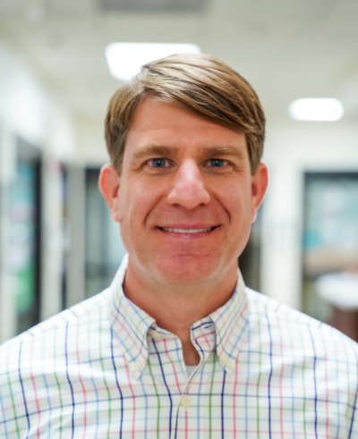
Provider Card
Displays a Provider and their name, title, and image while being linked to their personal Provider page.
Use the field to select which Provider to show.
Made to be used in the Flex Container to display Providers in a row.